| |
Thinking about Colour as Emotive - (with Mrs. E.'s poetry unit on 'feelings as colour')
1. The teacher is exploring colour as feeling with her classes (relating the story, I Feel Orange by Patricia Godwin and Kitty Macaulay) ie;
"I like yellow days.
Mr. Happy Sun lights up all the corners of my secret fort.
Joel, my best friend, plays with me all day.
Purple days are a muddle.
Sometimes I feel bright blazing purple.
Sometimes I feel gentle sad violet.
I don't know where I lost my shoes, and
It wasn't me that left the light on.”
My understanding:
1.Children are writing their own short prose poem with I Feel Orange as their prompt during a writing period.
They are thinking about and describing a colour and their feelings in relationship to the colour, and their everyday lives.
Colour is established as a personal thing, and is emotive personally. ie; Red can be sleepy, blue can be angry…
There is leading prompting for connections between feelings and colours AND the personal such as things/events/places or people.
Embedded in that are rich opportunities for personal imagery, self representation and dialogue as we work.
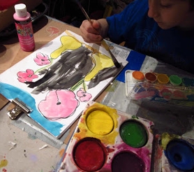
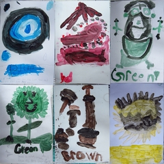
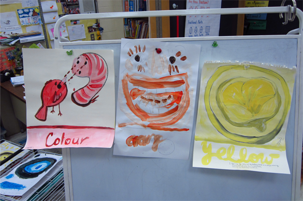
2. In a discussion with the artist in the classroom the children are asked to draw, and then paint, a picture inspired by their prose poem.
Examples are discussed briefly. They already know their colour from their poetic writing. They may chosse to write something new and spontaneous, and select a new colour, as part of their studio time. Many did.
A. Students draw a line near the bottom 1/3 of the page to write/attach their poem as text and/or draw their colour word
as large text.
China markers, or pencil are fine for this.
They can draw imagery from their poem to "fill the rest of the page".
They can think about and try to take ONE key element from what they are saying in their poemthat they have represented in their poem or that their poem inspires. : EMBLEM, OBJECT and IDEA are discussed We discuss how this is to help them structure a picture, and is open to all kinds of ways of drawing.
ie: “Purple days are a muddle…”could be a purple puddle or cloud with many busy lines/shapes in it…
”Mr. Happy Sun…” is a Happy Sun face or a brightly lit corner closeup or a fort or a rainbow…
”Sometimes I feel gentle and sad violet...” can inspire a drawing of a sad faced violet flower, a sad face in violet, a hand holding something gently…
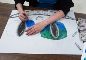
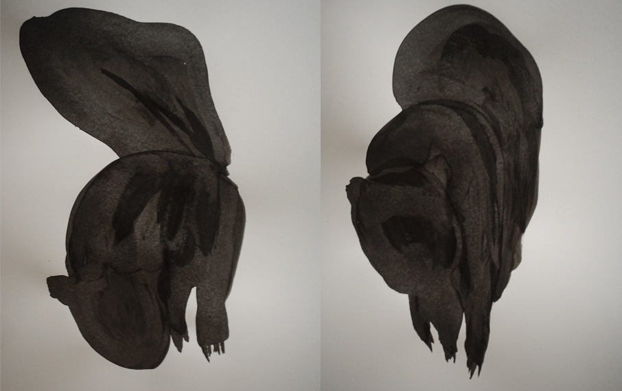
Visuals prompt students to use of different colour areas, outline with contrasting colours, and show the idea of gradation.
Verbal prompts include the idea of a rainbow, graffitti or cartoon-contour lines as ways to 'contain' colour. Gradation(light to lightest, bright to darkened, etc), contrast (differences between shades, between shades and tints, between colour and page, between text and image), and outline (to give contour/form through contrast) is discussed.
Scale, Form and Line are things to suggest during walk as postive critique or if children have a challenge with representing something. As they work, they will discover contrast is a way to create visual difference and dynamics in a painting this can be discussion prompt near the end of work or in review of the work.
B. The pure hue is the main colour in their composition. They need to mix TWO different Tints (mixing 2 different amounts of white with their pure hue ) and TWO Shades(mixing 2 different amounts of black with their hue), and use them in their composition This is a minimum:
If someone wants to swirl and jumble paints up great! It is a feeling piece...but they neeed to be able to point out at least two tints, two shades and their pure hue in their picture.
If their colour is pink or light blue or dark green to start…they need to work out from that in the same way. They may want to outline more with a tint, or shade, to create more contrast…or not.
and is mentioned as they are
Classroom Tempera paints and paper plates worked fine — set up with their pure hue in the middle, a blob of white and a blob of black at 10 and 4 and then the children can around the clock to mix. Water and paper towel and 3 brush sizes per student were useful, and we worked with each colour mode separately(tint then shade) initially, to take care to avoid too much cross-mixing - this was a challenge, but once we achieved our basic 5 things moved along.
Larger sheets of paper are better - 14 x 17.
|
|

 Projects & Happenings with young people